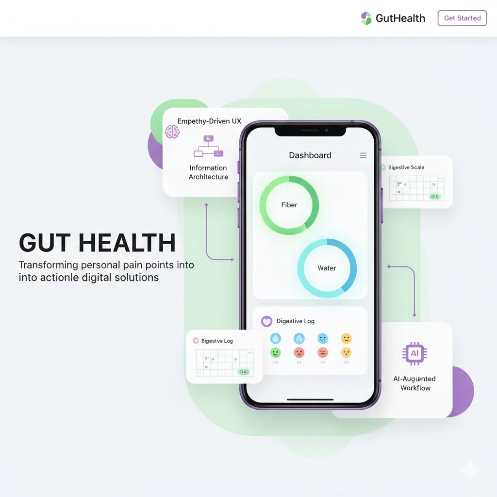
Gut Health
Started from a personal struggle. My partner and I both deal with chronic constipation.
We knew we needed to track what we ate to fix it, but let’s be honest—we were just too lazy.
Existing apps felt like a chore, forcing us to search through massive databases or count calories, which wasn’t our goal. We tried using phone notes, but it was a mess and impossible to analyze.
I wanted a "No-Friction" solution—something where we could log meals and check our gut health in just a few clicks. No tedious typing, no manual analysis. NutriFlow is built for people who want to stay healthy without the headache of a complicated app.
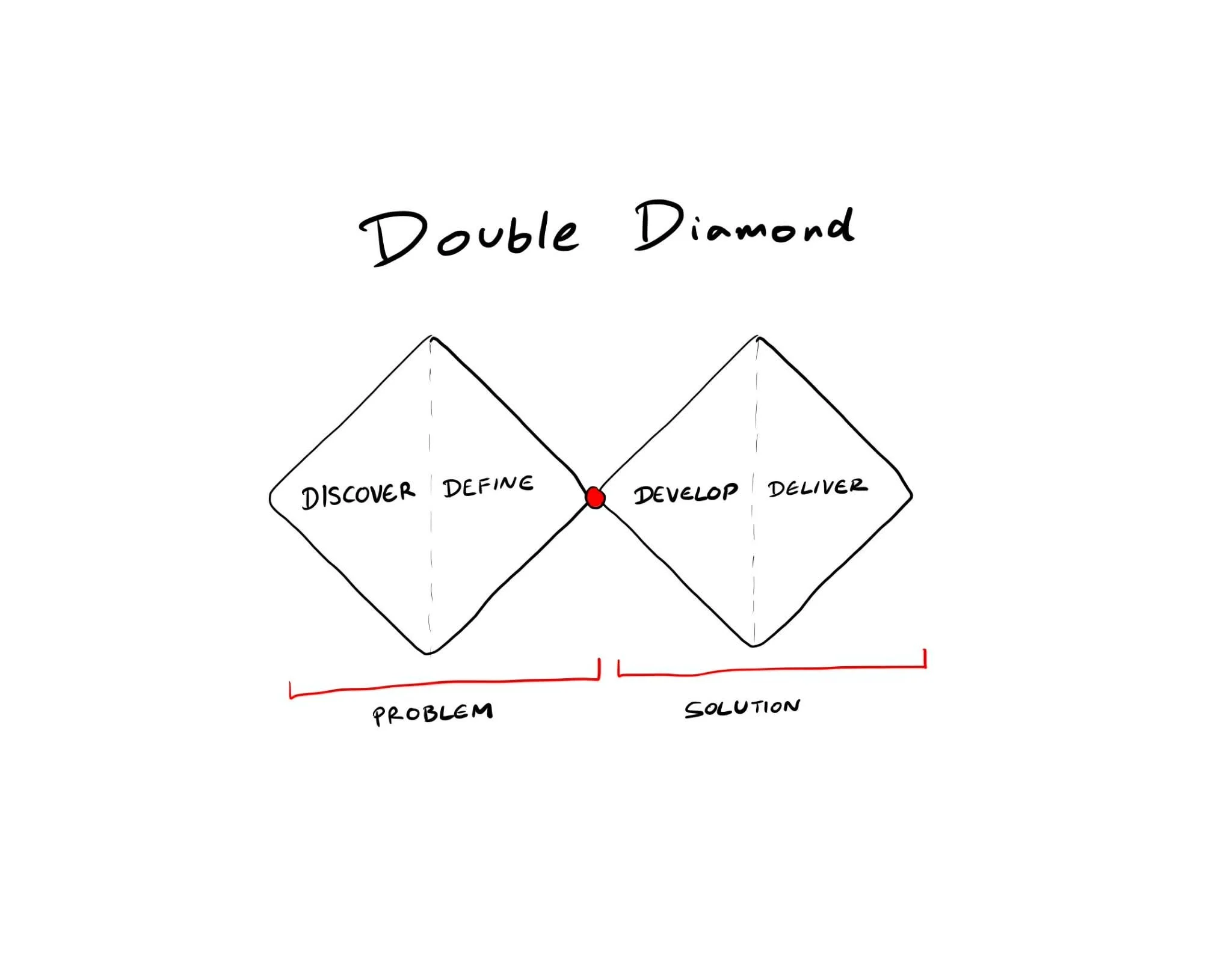
Double Diamond.
To build Gut Health, I didn’t just jump straight into coding or drawing screens. I used the Double Diamond framework as my roadmap. This process helped me dive deep into the real roots of our "lazy tracking" problem before narrowing it down to a practical solution. It ensured that I wasn't just building a pretty app, but one that actually solved our daily struggles.

Discover
The project began with a personal health challenge, both my partner and I suffered from chronic constipation. We wanted to change our eating habits, but existing apps were too cumbersome, focusing more on "weight loss" and "calorie counting" rather than gut health. We needed a tool that allowed us to log data in just a few clicks and provided instant analysis without the need for manual calculations.
Define
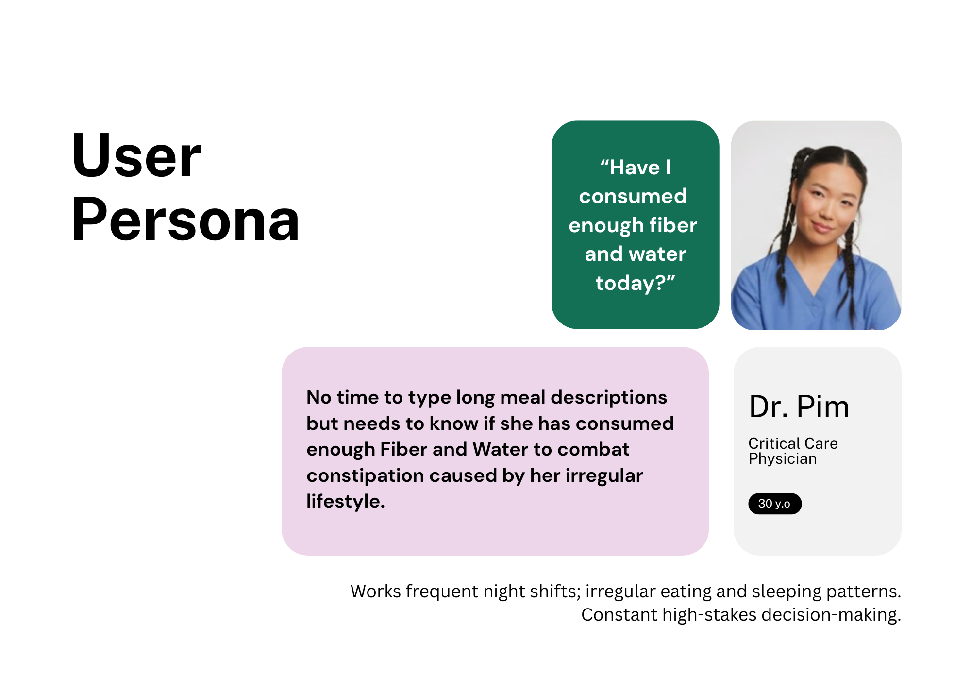
Through understanding the persona, I realized that the core problem is not calorie counting, but rather checking:
“Have I consumed enough fiber and water today?”
This insight led to the following How Might We (HMW) question:
"How might we help a fatigued doctor log her essential nutrients in seconds, without requiring any mental effort to analyze the data herself?"
To ensure the design served those with the least amount of time, I developed a User Persona of Dr.Pim to guide the decision-making process.
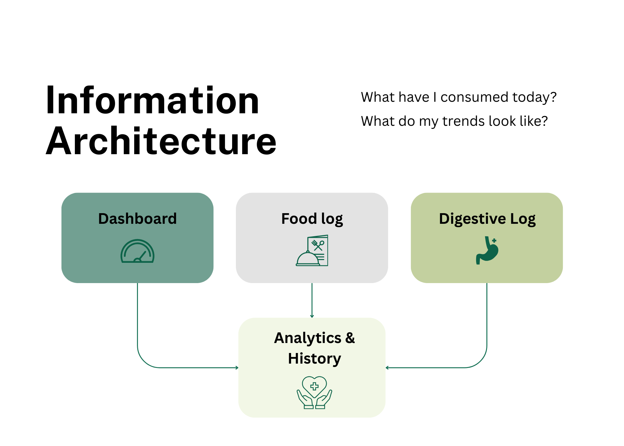
Information Architecture (IA)
Before diving into the UI, I mapped out the Information Architecture to ensure the app directly answered the user’s core questions: "What have I consumed today?" and "What do my trends look like?" To make the data actionable and easy to navigate, I structured the app around 4 Main Features:
Dashboard: A high-level overview featuring Daily Progress Gauges for instant feedback on Fiber and Water intake.
Food Log: The primary entry point for logging meals, integrated with the Smart Checklist and Auto-Tagging system for speed.
Digestive Log: A dedicated space to track bowel movements, allowing users to record bodily outcomes easily.
Analytics & History: A comprehensive view of past logs and data trends to help users identify patterns between their diet and digestive health over time.
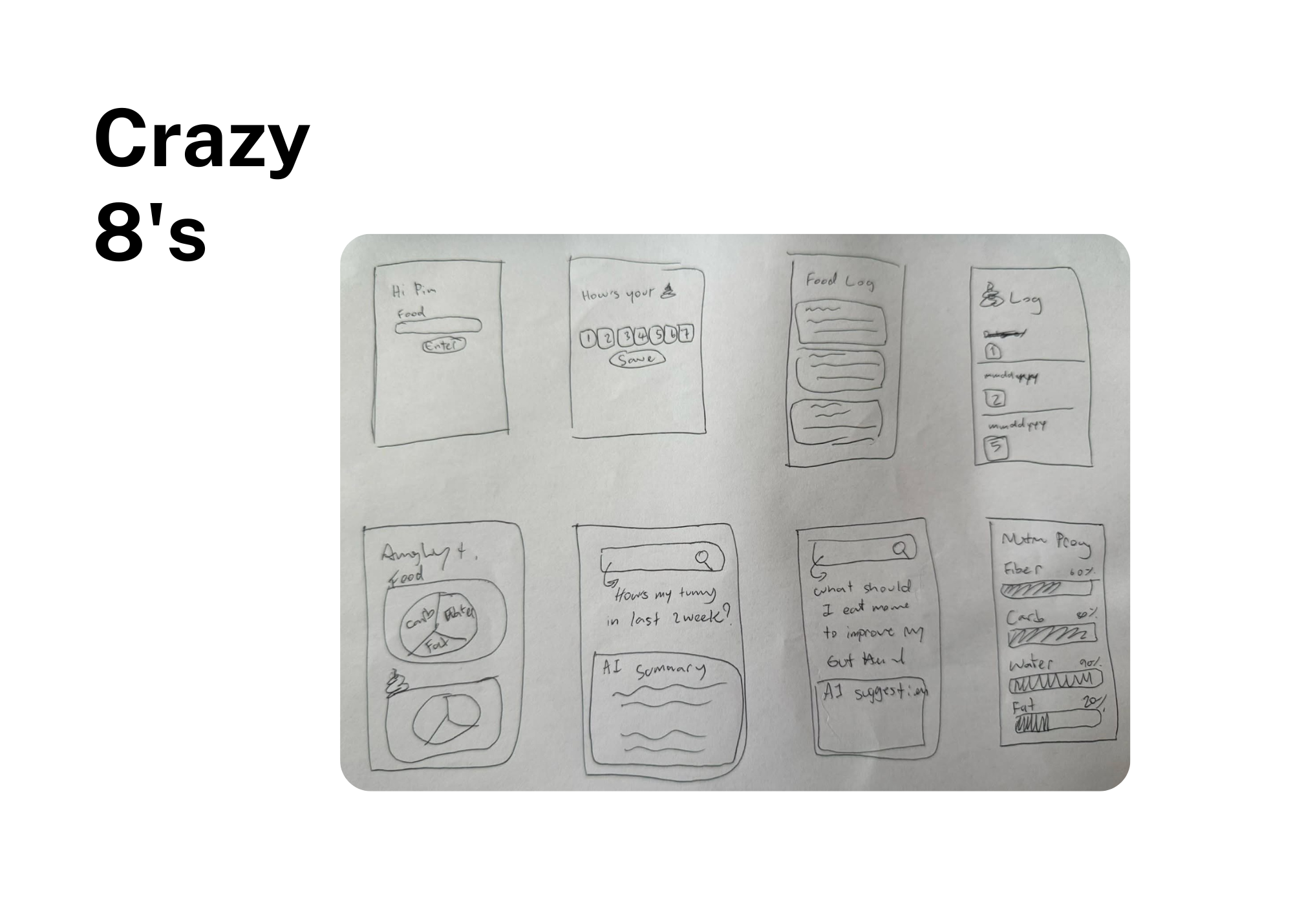
Develope
I started with the Crazy 8’s technique, sketching 8 different interface ideas in 8 minutes to find the fastest possible logging method. The winner was the "Hybrid Input" system:
Design Features: A short text input field paired with a Smart Checklist (Fiber, Protein, Carbs, Fat, Sugar, Water).
Visual Hierarchy: A vibrant Dashboard (Green-Blue tones to match Dr. Pim’s cheerful personality) using Visual Gauges instead of complex numbers. This allows users to understand their health status at a glance.
Deliver
I didn’t stop at static mockups. I wanted to build a Functional Prototype that could actually be tested and experienced.
Live on Figma Site: To make the project accessible, I used Figma to publish the final experience as a live site. This allows stakeholders to interact with the design and see how the AI-driven logic translates into a seamless user experience.
The Result: A live, functional web app that records timestamps, stores data locally, and provides real-time health visualization.
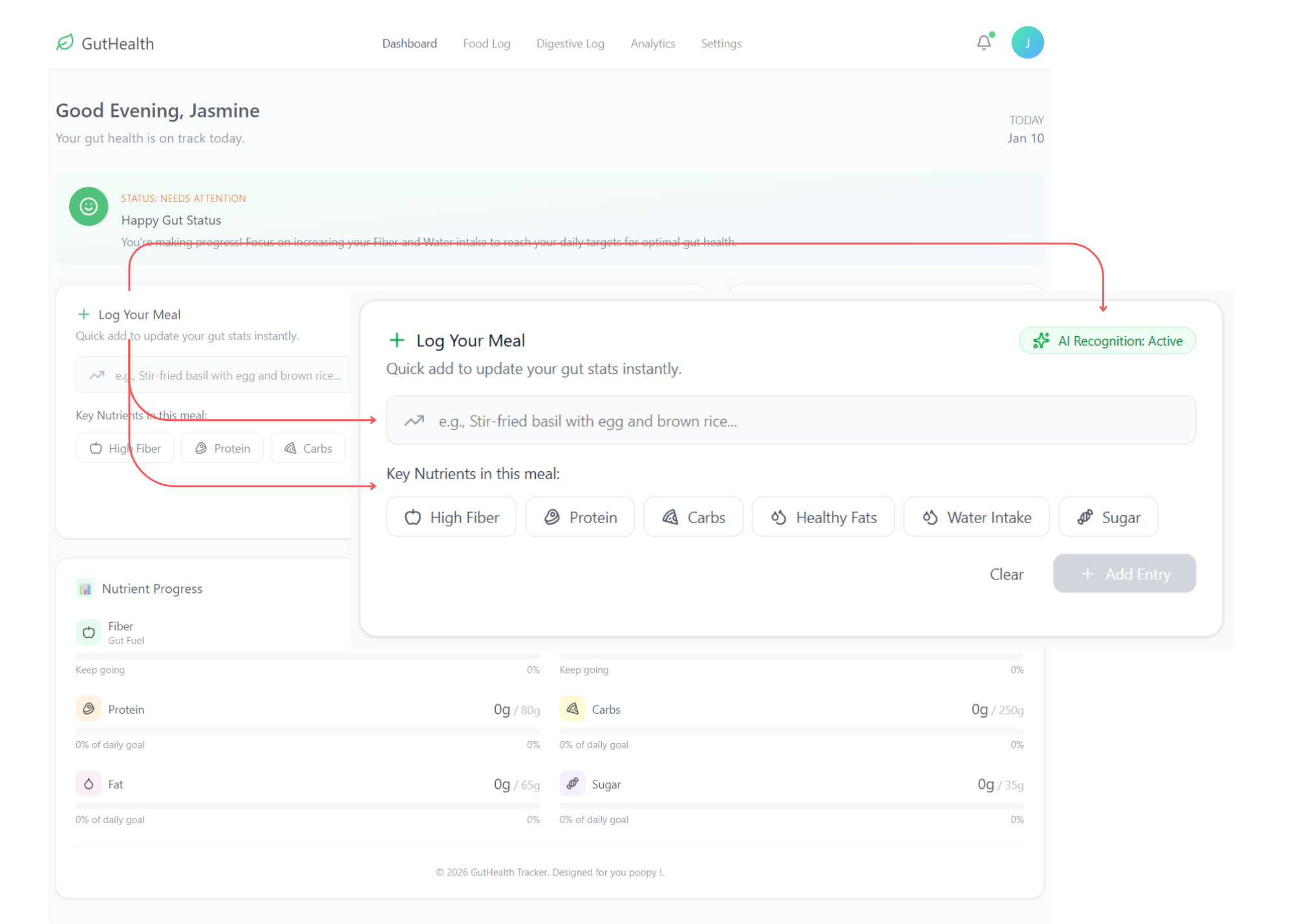
Dashboard
The dashboard is designed for high-efficiency users, like Dr. Pim, who require immediate data visualization with minimal interaction cost. It acts as a central hub where diet and bodily outcomes meet.
1. Smart Food Logging (The "Few-Clicks" CTA)
Log Your Meal: A prominent input field allows users to type their meals naturally.
AI Recognition: An active AI status indicates that the system is processing the text input to automate data entry.
Nutrient Tagging: Once a meal is entered, the app displays simplified tags such as High Fiber, Protein, Carbs, Healthy Fats, Water Intake, and Sugar. This provides a quick visual summary of the meal's composition without requiring the user to search through complex databases.
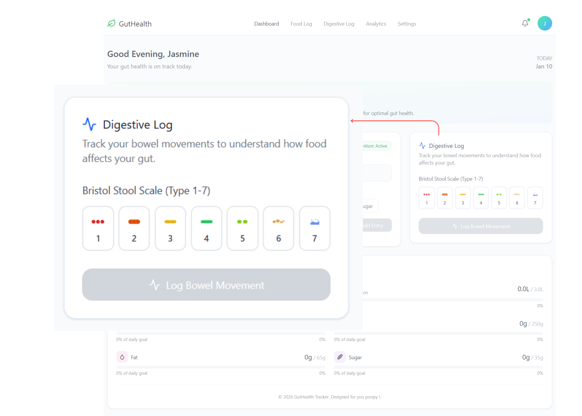
2. Medical-Grade Digestive Tracking
Bristol Stool Scale (Type 1-7): Tailored for users in the medical field, this feature replaces vague descriptions with a standardized clinical scale.
One-Tap Logging: Users can simply select a type (1-7) and click "Log Bowel Movement," making the process fast enough to perform even during a busy hospital shift.
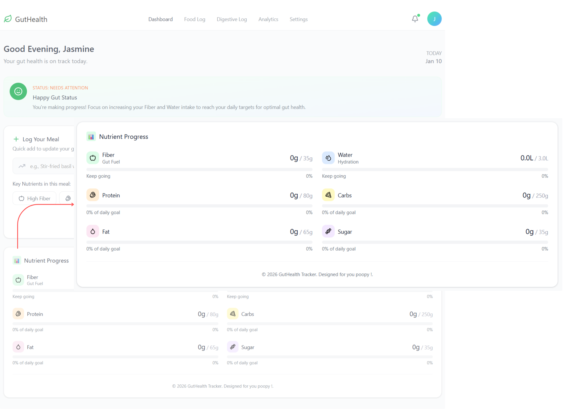
3. Real-Time Nutrient Progress
Visual Gauges: The bottom section displays daily progress for Fiber, Water, Protein, Carbs, Fat, and Sugar.
Goal Tracking: Each metric shows current intake versus the daily target (e.g., 0g / 35g for Fiber), allowing the user to identify nutritional gaps instantly.
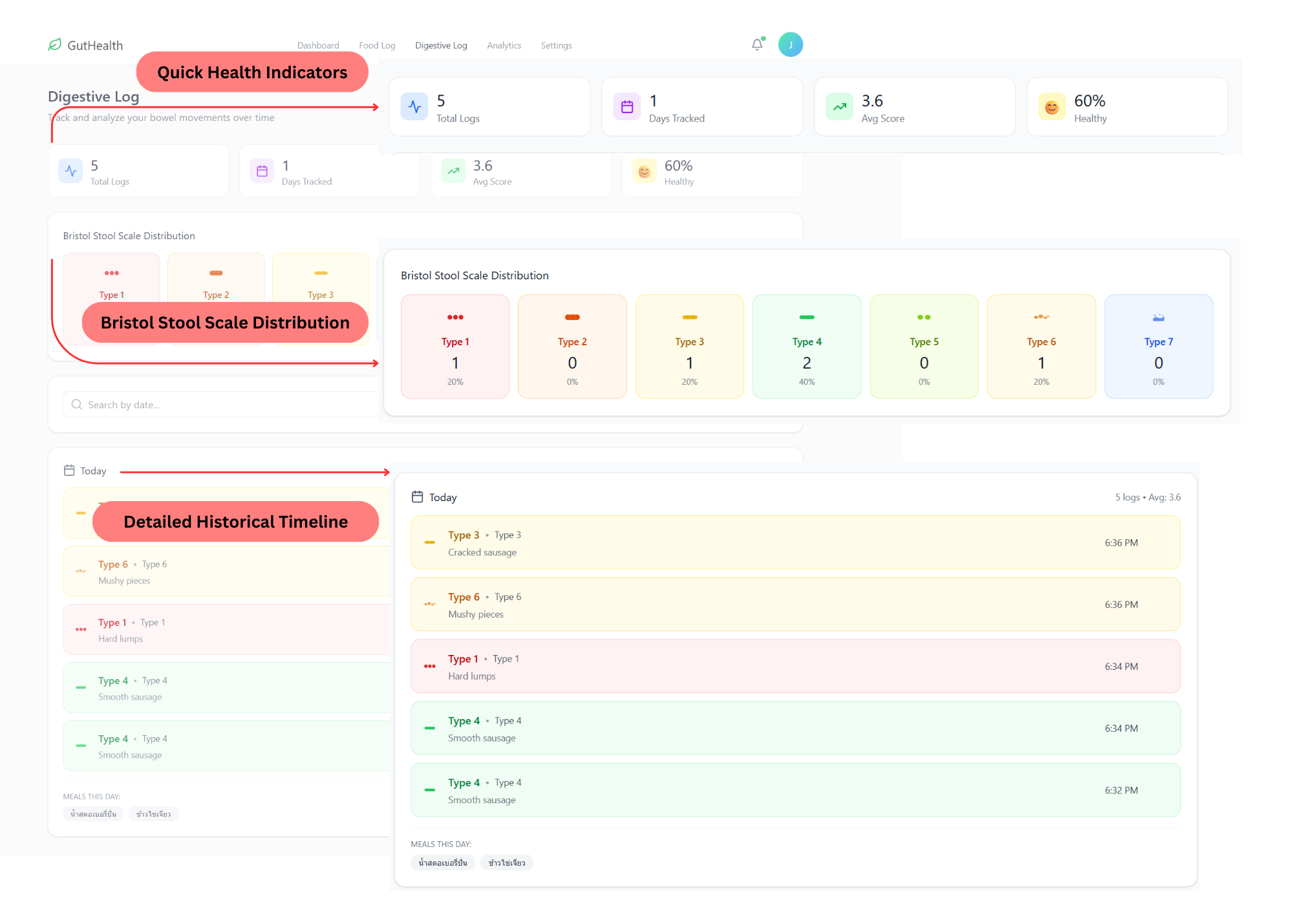
Digestive Log
This page bridges the gap between subjective feelings and clinical data. It is designed to help users track digestive outcomes using medical standards with high speed and precision.
The integration of the Bristol Stool Scale elevates the app from a simple diary to a medical-grade tracking tool, catering specifically to our persona's medical background while maintaining the 'few-clicks' efficiency for busy users.
Quick Health Indicators: The top dashboard provides an instant snapshot of gut health through metrics like Total Logs, Average Score, and a Healthy Percentage (currently 60% Healthy).
Bristol Stool Scale Distribution: By visualizing logs across the Bristol Stool Scale (Type 1-7), the app allows users to see frequency distributions and identify clinical trends at a glance.
Detailed Historical Timeline: Each entry provides a specific description (e.g., "Hard lumps" or "Smooth sausage") with an exact timestamp, ensuring high-quality data for medical review.
Intake-to-Output Correlation: A dedicated "Meals This Day" section appears at the bottom of the log, enabling users to easily correlate what they ate with their digestive outcomes on the same day.
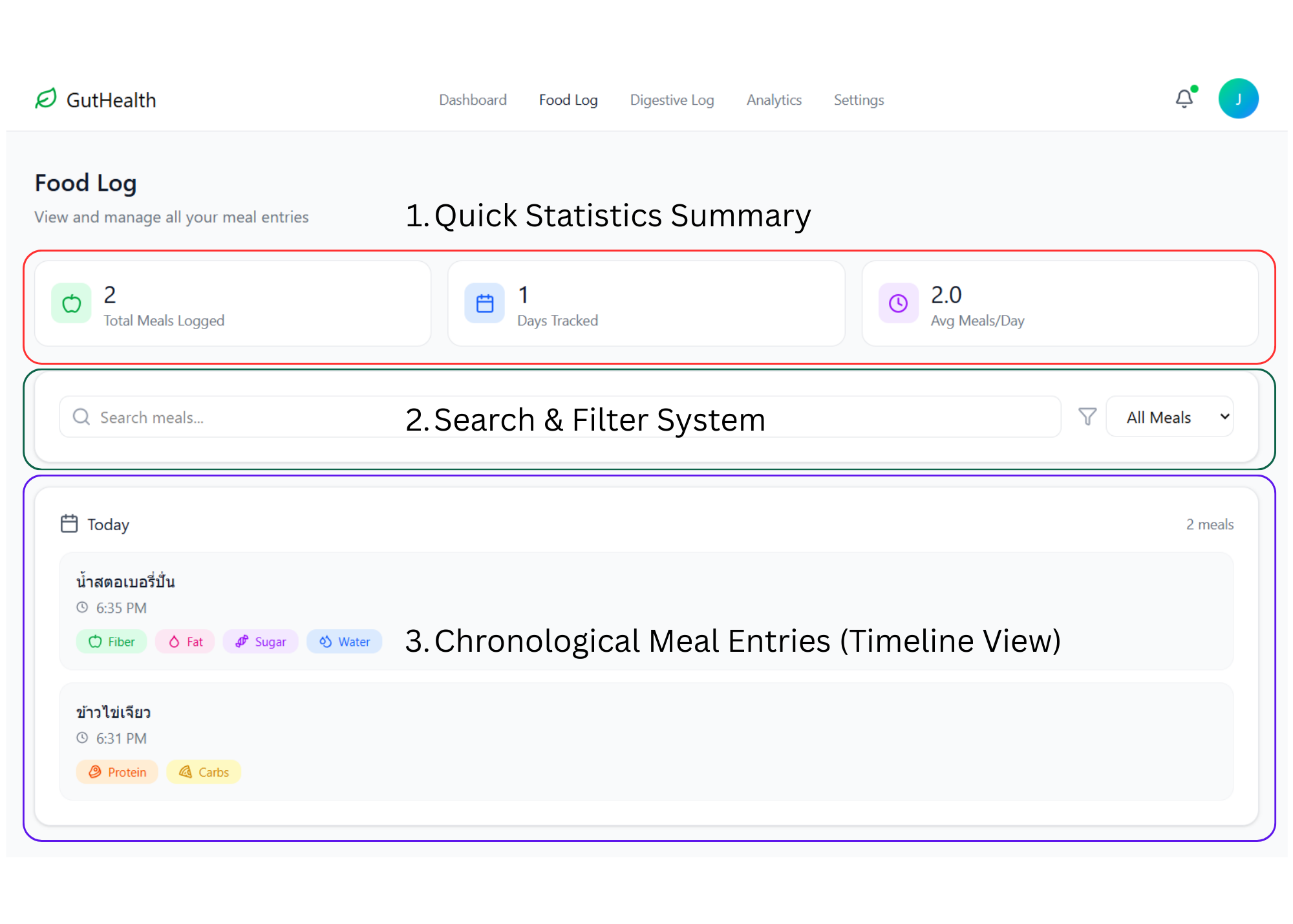
Food Log
The Food Log page serves as a comprehensive archive for long-term dietary management. While the Dashboard focuses on "the now," this page allows users to look back at their habits to identify long-term patterns.
The primary UX goal for the Food Log was to transform a simple list into a learning tool. By seeing that a "Strawberry Smoothie" contains high sugar and fiber while "Omelet with Rice" provides protein and carbs, users can begin to understand why their digestion might feel different on different days without having to be a nutrition expert.
1. Quick Statistics Summary
At the top of the interface, users are greeted with high-level data cards for instant feedback:
Total Meals Logged: Displays the total volume of data captured by the user.
Days Tracked: Shows the consistency and duration of the user's health journey.
Avg Meals/Day: Provides insight into eating frequency and routine stability.
2. Search & Filter System
To handle a growing database of entries, I implemented tools for easy information retrieval:
Search Bar: Allows users to find specific past meals quickly by name.
Category Filter: A dropdown menu to sort entries by meal type or timeframe.
3. Chronological Meal Entries (Timeline View)
The core of this page is a clean, time-stamped list of everything the user has consumed:
Timestamped Records: Precise logging (e.g., 6:35 PM) is crucial for users like Dr. Pim, whose eating schedule shifts daily.
Visual Nutrient Tags: Each entry displays the colorful tags generated by the AI or selected by the user (Fiber, Fat, Sugar, Water, etc.). This makes it easy to spot which meals were "gut-friendly" at a glance.
Grouping by Date: Entries are grouped by day to help users correlate their intake with their Digestive Log outcomes for that specific date.
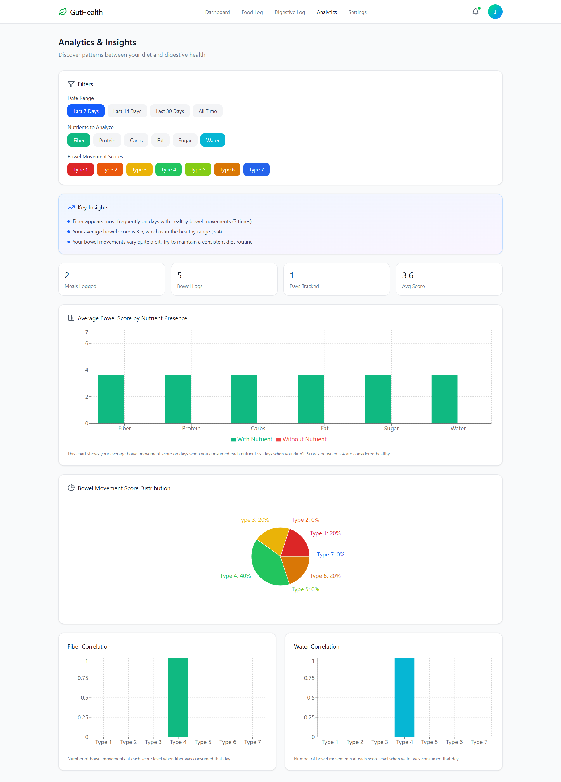
Analytics & Insights
This page acts as the app's "brain," automatically processing logged data to reveal the hidden links between diet and digestive health, eliminating the need for manual analysis.
The Analytics page fulfills the 'No-Analysis' promise of the project, moving beyond simple tracking to provide Actionable Insights that empower users like Dr. Pim to make informed lifestyle adjustments instantly.
Customizable Filters: A flexible filtering system allows users to view data by specific timeframes (7, 14, or 30 days) or focus on particular nutrients and bowel movement types.
AI-Generated Key Insights: The highlight of this section is the automated insights that provide concrete conclusions, such as confirming the frequency of healthy bowel movements on high-fiber days or verifying average health scores.
Nutrient-Outcome Correlation: Comparative bar charts visualize how different nutrient presences (e.g., Fiber, Protein, Water) affect the average bowel movement score, pinpointing exactly what drives better health outcomes.
Bowel Movement Score Distribution: A clear Pie Chart gives a statistical overview of the user's digestive health over time, making it easy to see if they are predominantly within the healthy "Type 3-4" range.
Deep Dive Correlations: Specific correlation graphs (e.g., Fiber and Water Correlation) show the exact number of bowel movements at each score level when those specific nutrients were consumed, providing granular proof of what works for the user's body.
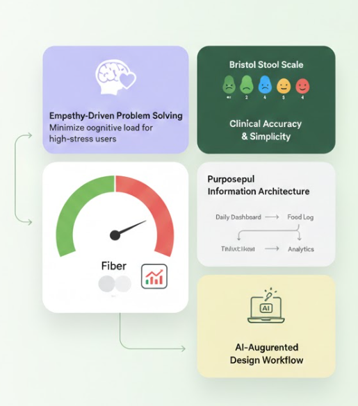
Key Lessons Learned
Empathy-Driven Problem Solving: By starting with a personal pain point shared with my partner, I learned that the most effective UX is one that minimizes cognitive load—especially for high-stress, time-poor users like medical professionals.
Balancing Simplicity with Clinical Accuracy: I mastered the challenge of transforming complex medical data, such as the Bristol Stool Scale, into a fast, "few-clicks" interface that maintains clinical integrity while remaining user-friendly.
Purposeful Information Architecture: Mapping the journey from a daily Dashboard to long-term Analytics taught me the importance of designing systems that don't just "store" data, but "process" it into actionable insights for behavioral change.
AI-Augmented Design Workflow: Moving beyond static mockups into a functional prototype using Windsurf (AI IDE) and implementing AI Keyword Matching allowed me to understand technical feasibility and the power of AI in scaling a designer’s capabilities.
Data Visualization for Better Health: I refined my skills in using visual cues and color-coded gauges to communicate health status instantly, turning abstract numbers into a motivating and intuitive progress story.